Helper: A Friendly, High-Impact Display Font for Digital Design
As a web and UI designer who ships dozens of landing pages, SaaS dashboards, and e-commerce experiences each year, I’ve learned that typography isn’t just about aesthetics—it’s functional infrastructure. Helper stands out precisely because it bridges personality and performance: a bold, hand-drawn display font built for digital clarity without sacrificing warmth or energy.
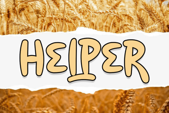
Visually, Helper features heavy, confident proportions—thick strokes, generous x-heights, and subtle organic irregularities that suggest human touch without compromising legibility. It’s not a script font or a delicate handwritten typeface; it’s a modern display font with grounded rhythm and approachable weight. That makes it ideal for interfaces where you need instant recognition, emotional resonance, and strong visual hierarchy—all in one glance.
Where Helper Delivers Real Layout Value
In practice, Helper excels where attention is scarce and intent matters most. Use it for hero section headlines on product landing pages—its energetic silhouette commands focus above the fold while reinforcing a brand’s upbeat, accessible tone. On coaching or creative service sites, Helper works beautifully in section headers like “How It Works” or “What You’ll Learn,” giving structure without stiffness.
For online stores—especially boutiques, handmade goods, or wellness brands—Helper adds distinctiveness to banners, category labels, and limited-time offer callouts. Its thickness ensures impact even at smaller sizes on mobile, and its open letterforms hold up well over image overlays or gradient backgrounds. Try it on CTA buttons like “Start Free Trial” or “Get Your Guide”—not as body text, but as a decisive, friendly anchor point in conversion-focused layouts.
It also shines in branded digital content: blog headers, course module titles, portfolio project cards, and social media graphics exported from Figma or Webflow. Because Helper communicates enthusiasm and approachability, it supports brands that want to feel human-first—not corporate, not sterile, but intentionally warm and confident.
Readability & Responsiveness: What You Need to Know
Helper is designed for display use—not long-form reading—so pair it wisely. Never use it for paragraphs, form labels, or navigation menus. Instead, reserve it for short, high-impact phrases: headlines under 8 words, button copy under 4 words, logo lockups, and decorative accents like quote pulls or testimonial highlights.
On mobile, Helper remains legible down to ~28px headline size with proper line-height (1.1–1.2) and letter-spacing (0–2px tracking). Avoid ultra-tight tracking—it diminishes its hand-drawn charm. For dark mode or dark backgrounds, ensure sufficient contrast (at least 4.5:1 against #121212); its thick strokes help, but test with real users. On light backgrounds or soft image overlays, Helper gains extra pop—just confirm your overlay opacity doesn’t mute its energy.
Smart Pairing for Balanced Digital Typography
Helper thrives when paired with a clean, neutral sans serif—think Inter, Manrope, or IBM Plex Sans—for body copy, captions, and interface text. That contrast reinforces hierarchy: Helper sets the tone, your sans serif delivers information. For editorial or premium brand sites, a restrained serif like Lora or Cormorant Garamond can add sophistication while keeping Helper’s friendliness intact.
Avoid pairing Helper with other display fonts, scripts, or overly geometric sans serifs—they compete for attention. And skip monospace or ultra-thin fonts; they clash tonally and visually. Consistency matters: use Helper across all key brand touchpoints—website headers, email subject lines (as web-safe fallbacks allow), digital ads, and branded Notion or Figma templates—to reinforce a cohesive online identity.
Licensing, Formats & Practical Integration
Helper is a premium font available in standard webfont formats (WOFF2, WOFF) and includes multiple weights—ideal for establishing clear typographic scale across breakpoints. Check whether your license covers web embedding, SaaS platforms, client projects, and digital template resale; most commercial licenses do, but always verify before deploying on live production sites or white-labeled tools.
It supports Latin-based languages and includes basic OpenType features—ligatures, stylistic alternates, and case-sensitive forms—that let you fine-tune character flow for logos or custom wordmarks. No variable axis yet, but its static weights give reliable control for responsive CSS declarations using @font-face and font-display: swap for fast loading.
When to Choose Helper Over Other Display Fonts
If your brand voice leans into optimism, creativity, or approachability—and your layout needs a typeface that feels both substantial and human—Helper earns its place. It’s more grounded than a playful script font, more distinctive than a generic bold sans, and more versatile than a narrow decorative typeface. Unlike many display fonts that fade at small sizes or blur on low-DPI screens, Helper maintains clarity across devices and contexts.
Use it for a children’s learning app’s milestone badges, a sustainable fashion brand’s seasonal campaign banners, a freelance designer’s portfolio headline, or a mental wellness app’s onboarding screen. In every case, Helper doesn’t shout—it invites. And in digital design, where first impressions happen in milliseconds, that invitation is everything.